Small Business Website — Web Design — Solo Project
Compton’s Hardware Store
Designing and building a website for a family-run hardware business, helping them reach more customers and share their passion for gardening and homeware online.
Overview
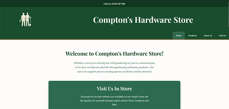
For this project I was given the chance to pick from three businesses and build a website for one of them. I chose Compton’s Hardware Store, a small family business run by a father and son who share a passion for gardening and homeware. The goal was to help them push their business online, attract more customers to their store, and communicate who they are as a brand.
The Problem
Compton’s Hardware Store is a local, family-run business with real personality and over 30 years of experience. The challenge was taking that warmth and trust and translating it into a website that would make new customers feel confident choosing them over larger competitors like B&Q, IKEA, or Screwfix.
The website needed to do three things clearly: showcase their products, tell their story, and make it easy for customers to find and visit the store.
Research
I researched competitor websites including IKEA, B&Q, Screwfix, Wickes, and Willow Alexander Gardeners to understand how similar businesses present their products, layout their content, and use colour and typography to communicate trust and quality.
I also thought carefully about the target audience. Compton’s customers are likely to be gardeners of all experience levels, homeowners looking for quality products, and families who enjoy DIY projects. Understanding this helped me make sure the tone of the website felt welcoming and accessible rather than technical or intimidating.
For branding I used the brand persona approach from the course handbook. I thought about what kind of person Compton’s would be: experienced, trustworthy, family-oriented, and passionate. That informed the colour choices, typography, and the tone of all the written content.
Sketches & Wireframes
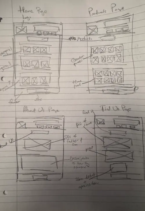
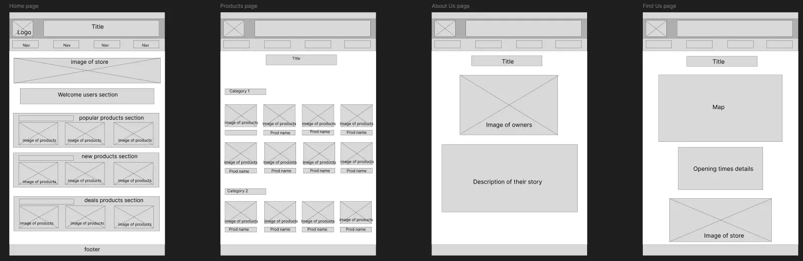
I planned out the content for each page before starting the design, following the content-first approach. The site needed four pages: a homepage, a products page, an about us page, and a find us page.
Key Design Decisions
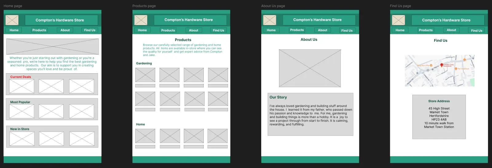
- Colour palette — I chose dark green as the primary colour because green communicates nature, growth, and trust, which fits a gardening and homeware business perfectly. It also helped differentiate Compton’s from the more corporate blue and orange palettes used by larger competitors.
- Brand identity — the logo and overall design needed to feel family-run and approachable, not corporate. I kept the design clean but warm so customers could trust the business immediately.
- Content structure — the homepage prioritises welcome, current deals, popular products, and new arrivals. This mirrors how physical shops work and gives customers a reason to keep scrolling.
- About Us page — I included the personal story of Compton and his son Jake in their own words. This is what makes a small business stand out from a large retailer and builds emotional connection with customers.
- Mobile-first — written mobile-first with responsive breakpoints since many customers would be browsing on their phones.
- Simple navigation — kept straightforward with clear labels so any user regardless of technical ability can find what they need quickly.
Outcome & Reflection
This was my first project where I had to think seriously about mobile screen sizes alongside desktop, which introduced me to responsive design challenges I hadn’t faced before.
I also learned the importance of brand identity. A strong brand is what makes people trust a business, especially a small one competing against larger names. Every design decision I made had to serve the brand first.
If I were to do this project again I would have more fun with the visual design. Because I was thinking about the business wanting to appear professional, I held back on more expressive design choices. I would now feel more confident pushing the visual identity further while still maintaining that sense of trust and professionalism.