Typesetting — Web Design — Solo Project
Typesetting Literature Project
A typesetting project that challenged me to let the content lead the design and think critically about who we include and exclude through our design decisions.
Overview
This was one of the first websites I built on my course. The brief was to choose a text and design a website around it, letting the content lead every design decision. I chose Design for Real Life by Eric Meyer and Sara Wachter-Boettcher, a book about how design systems can unintentionally exclude or harm people. Reading it before designing anything changed how I thought about every choice I made.
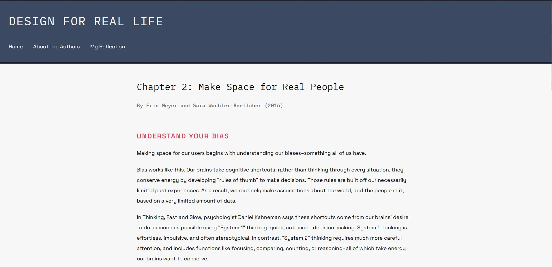
The Problem
The book made me think hard about something uncomfortable: design decisions that seem neutral can actually exclude real people. A font that is hard to read for someone with dyslexia, a colour contrast that fails for someone with low vision, a layout that assumes everyone reads linearly. These are not small details. They are the difference between someone being able to use your site or not.
As a UX designer, thinking about inclusivity from the start and not as an afterthought became the core challenge of this project.
Research
The book itself was the primary research. I also researched my target audience, people who may be reading complex content online while distracted, tired, or overwhelmed. This influenced my typography, layout, and colour decisions.
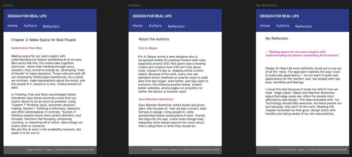
I explored two concept directions. Concept A was calm and empathic, designed to reduce cognitive load with soft colours and warm typography. Concept B was more direct and structured, reflecting real-world conditions of stress and distraction with stronger contrast. I chose Concept A because the primary goal was to create a supportive reading environment and it achieved this most effectively.
Sketches & Wireframes
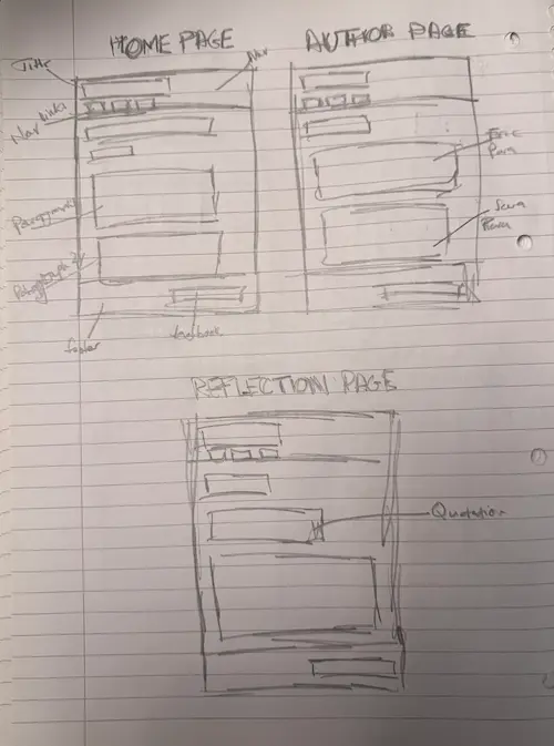
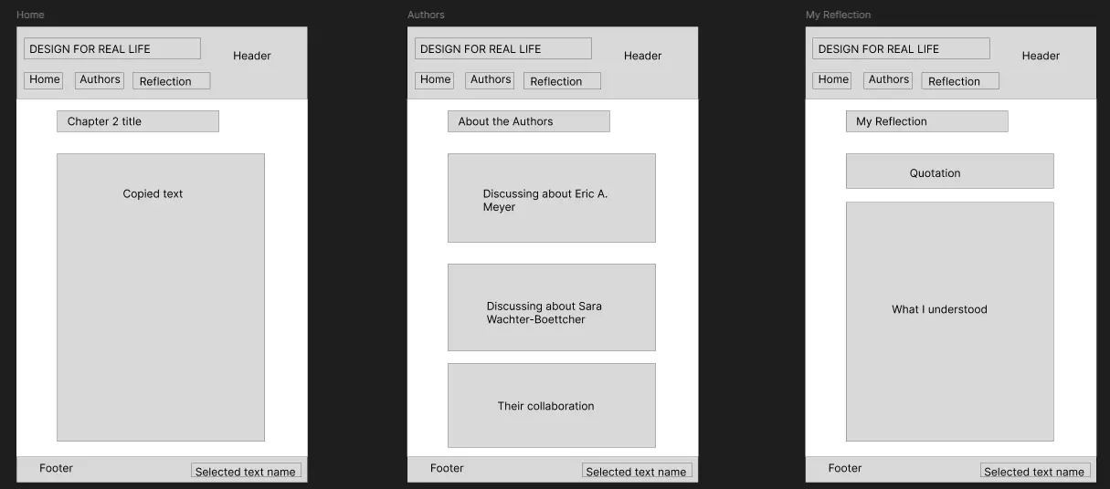
I started with hand-drawn sketches exploring different layout and navigation structures before moving into digital wireframes for both concepts.
Key Design Decisions
- Content-first approach — I read the book in full before touching Figma. The design grew out of the content, not the other way around.
- Typography — Libre Baskerville for headings because of its warm, readable feel. Source Code Pro for body text because it is clean and consistent even as a monospaced font. Together they create a clear visual hierarchy while supporting the goal of reducing cognitive load.
- Colour palette — soft, warm tones to create a relaxing reading environment. All text meets WCAG contrast guidelines for accessibility.
- Navigation — kept at the top in a familiar position. Testing showed that unfamiliar navigation placements added cognitive load for readers.
- Mobile-first — written mobile-first with responsive breakpoints so the site works on any device.
Outcome & Reflection
This project taught me that good research-based design can still look clean and work beautifully while being genuinely inclusive. The two are not in conflict.
It also reminded me that as a UX designer I have a responsibility. The people who feel left out by design decisions are often the ones who are never in the room when those decisions are made. That has to change and it starts with thinking about those people from the very beginning.
If I were to do this again I would push the visual design further. Because I was so focused on accessibility and readability, I held back on more expressive choices. I would like to explore how you can have both, a site that is inclusive and visually distinctive at the same time.