Portfolio — UX/UI Design — Solo Project
Portfolio Project
How do you design a portfolio that shows you’re a UX/UI designer without having to say it out loud?
Overview
I was tasked with building a portfolio that showcases who I am, my skills, and my ambitions. My target audience were recruiters and hiring managers who skim through many portfolios quickly so the design had to communicate immediately. The challenge was making something that felt genuinely mine while still being professional, accessible, and sustainable.
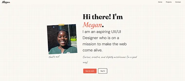
The Concept
As a designer I always have a notebook and pencil nearby. I wanted my portfolio to feel like you’ve walked into my workspace mid-process, something being planned, not something finished. That honest, slightly messy energy felt more true to who I am than a polished template.
This led to the sketchbook concept: graph paper background, washi tape, a tilted photo, and hand-drawn illustrations. Nothing perfectly uniform because my journey as a designer hasn’t been either.
Wireframes & Mockup
I started with pen and paper sketches before moving into Figma for wireframes and a hi-fi mockup, following the content-first approach from my course.
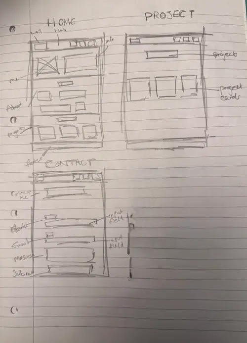
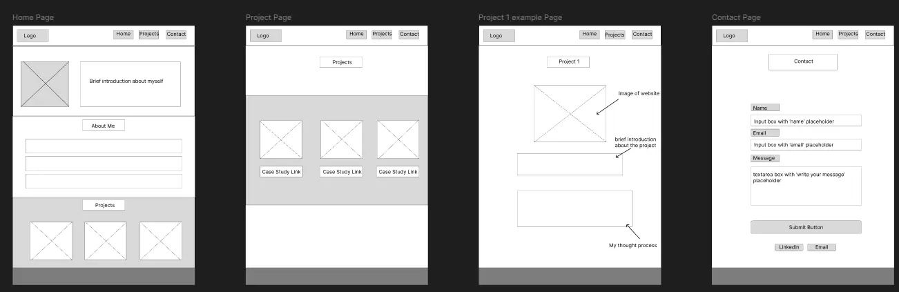
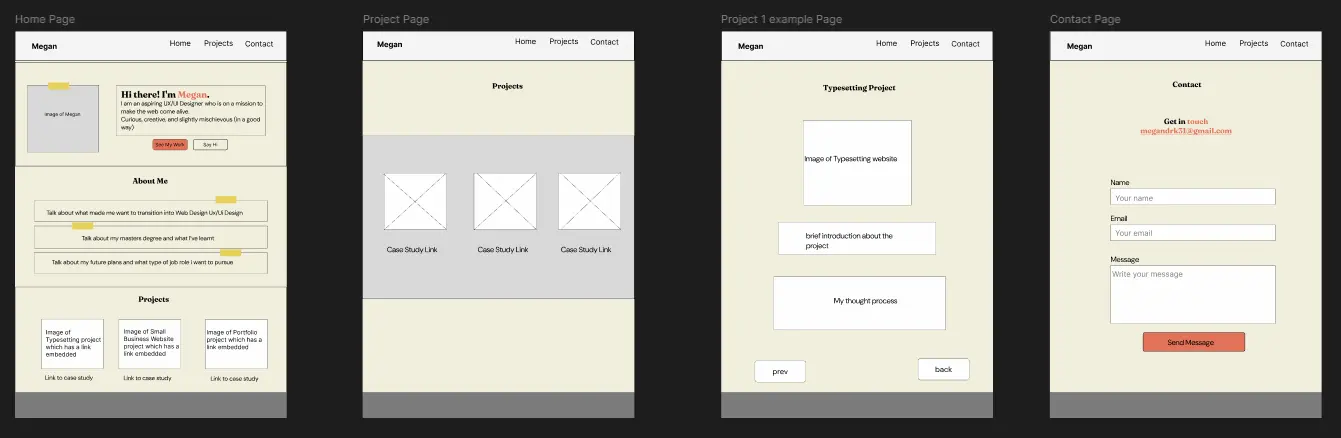
Illustration Process
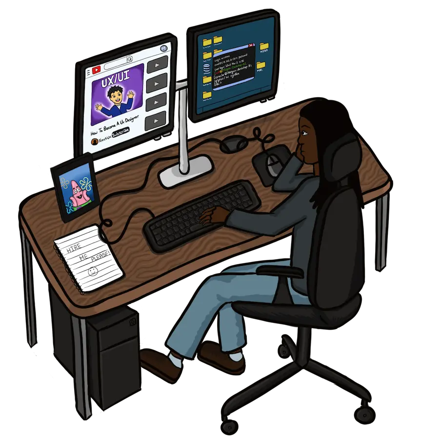
I drew four illustrations in Procreate, each representing a chapter of my story. The hand-drawn style was a deliberate choice that reinforces the sketchbook concept and shows a creative skill that sets this portfolio apart.
Key Design Decisions
- Graph paper background — Pure CSS using
linear-gradient, no image file needed. - Yellow tape — Custom SVG placed with CSS
::before, each one at a slightly different angle. - Three fonts — Fraunces for headings, DM Sans for body text, Caveat for handwritten accents. Each has two fallbacks.
- Pencil cursor — Limited to the hero section only so it doesn’t confuse users who rely on cursor changes to understand what they can interact with.
- Mobile-first CSS — Base styles written for mobile, layout changes introduced at 600px and 900px breakpoints
- WebP images and SVGs — Chosen for sustainability, keeping page weight as low as possible.
- Alt text on all images — Descriptive text added to every image and illustration for screen reader users.
Outcome & Reflection
The portfolio passed HTML and CSS validation, works across mobile, tablet, and desktop, and reflects my personality clearly. The sketchbook concept started from a simple observation that I always have a pen and paper nearby and became the entire identity of the site.
If I were to do this again I would explore SVG format for illustrations from the start to avoid the quality compromise that came with converting to WebP. I would also include more UX-focused projects to better demonstrate my design thinking to employers.